| Keep It SImple - Users Are Stupid |
| Written by Janet Swift | |||
| Wednesday, 30 November 2016 | |||
|
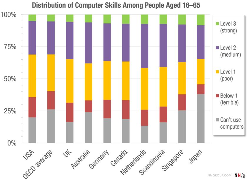
Over two thirds of the adult population in developed countries have poor or non-existent computer skills. By and large this is the audience you are developing apps and interfaces for - and it is important not to underestimate their lack of ability as end users. The chart below of the distribution of computer skills was compiled by the OECD (the Organisation for Economic Co-operation and Development) which represents the rich industrialized (computerised) nations of the world. The data it is based on was collected from 2011–2015. A total of 215,942 people in the age range 16-65 (i.e people of working age) were tested, with at least 5,000 participants in most of the 33 countries included. Participants were asked to perform 14 computer-based tasks. and rather than using websites, the participants attempted the tasks on simulated software on the test facilitator’s computer. This allowed the researchers to make sure that all participants were confronted with the same level of difficulty across the years and enabled controlled translations of the user interfaces into each country’s local language. The tasks varied in complexity. At Level 0, referred to by the researchers as "Below Level 1" tasks were: based on well-defined problems involving the use of only one function within a generic interface to meet one explicit criterion without any categorical or inferential reasoning, or transforming of information. Few steps are required and no sub-goal has to be generated. An example of this type of task is "Delete this email". At Level 1, asks used familiar applications such as email with little of no navigation or use of menu commands. One example was to use the reply-all feature of an email program to send a response to three people, another task at this level was to find all the emails from a specific person. At the intermediate Level 2 respondents might have to navigate within an application and use its tools. An example was to "find a sustainability-related document that was sent to you by John Smith in October last year.” At Level 3 the additional requirements were multiple steps and operators and tasks that require integrating information from multiple sources and evaluating the relevance and reliability of information in order to discard distractors. An example task was to schedule a meeting room in a scheduling application, after piecing together information contained in several email messages. Another was “You want to know what percentage of the emails sent by John Smith last month were about sustainability.” The results are quite an eye-opener for developers who may charitably assume that most users have the same level of computer-ability as they do themselves. The average across the countries in the survey is in the second column and reveals that 5% of respondents achieved strong computer skills. i.e. Level 3. Even Japan, which came out best for Level 3, the percentage is only 8% and the USA, the primary audience for many developers, was just below the average. The OECD average for Level 2 is 26%, so if you add Levels 2 and 3 together as a "computer competent" the total is less than a third. Yellow (Level 1) representing "barely computer literate" is the biggest group, 29% on average although it varies quite a bit across different countries. What is more important is that once you take out the 25% people who can't use a computer - and we can widen this to "can't use digital technology", and so aren't likely to be interested in apps, you still have a huge pool around half who will struggle to use them! Commenting on these results, usability expert Jakob Nielsen, co-founder of the Nielsen Norman Group, writes: One of usability’s most hard-earned lessons is that you are not the user. This is why it’s a disaster to guess at the users’ needs. Since designers are so different from the majority of the target audience, it’s not just irrelevant what you like or what you think is easy to use — it’s often misleading to rely on such personal preferences. For sure, anybody who works on a design project will have a more accurate and detailed mental model of the user interface than an outsider. If you target a broad consumer audience, you will also have a higher IQ than your average user, higher literacy levels, and, most likely, you’ll be younger and experience less age-driven degradation of your abilities than many of your users. I have to agree and I can think of plenty of examples where software products fail simply because their developers don't bother to hand the product over to "ordinary" end users to see what happens. We need to discover what happens in the wild and also need if necessary to sacrifice style to simplicity. The reward will be giving access to a much larger audience. More InformationThe Distribution of Users’ Computer Skills: Worse Than You Think OECD (2016), Skills Matter: Further Results from the Survey of Adult Skills, OECD Publishing, Paris. Related ArticlesWhy Touch Screens Are Terrible For Games And What To Do Webgazer.js An In-Browser Eye Tracking Library
To be informed about new articles on I Programmer, sign up for our weekly newsletter, subscribe to the RSS feed and follow us on Twitter, Facebook or Linkedin.
Comments
or email your comment to: comments@i-programmer.info |
|||
| Last Updated ( Wednesday, 30 November 2016 ) |


