| Apple Goes Flat - Where's The Logic In That? |
| Written by Lucy Black | |||
| Tuesday, 11 June 2013 | |||
|
Apple's dev conference, WWDC, has been light on any real announcements that actually affect developers, but the news that the UI has been "made over" in iOS7 gives programmers a lot of work - for what? First it is important to state that I am a programmer and also in a lesser role an end user. I am not a UI design expert. but I still have the right to say "I know what I like". So does every potential iOS 7 upgrader and guess what they are not all UI design experts either. Users either get it - or they don't. This is what usability testing is supposed to be all about, although it has to be admitted that this is something of a crude instrument when trying to gauge how much users "get" an interface with a piece of complex machinery. Essentially what has happened at Apple is a sweeping away of the old and the introduction of the new. Design, art and taste are often a reaction to what went before. Iconoclasts are forever deleting the old icons and introducing new ones. Until, of course, the old icons become old enough to be design classics when it's okay to like them again
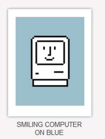
copyright Susan Kare.
So the shock of the new is really only possible by having an old to react to. Is this what the new design is all about? The most obvious aspect of the new iOS7 design is that it is described as "flat". It is a rejection of skeuomorphy - something that was heavily promoted by Steve Jobs. Now we have Johny Ive basically throwing out the designs so liked by Steve Jobs and replacing them with flat non-skeuomorphic designs.
Skeuomorphism is where a technology retains the symbolism, or even the mechanisms, of an older technology even though this isn't necessary any longer. For example, a skeuomorphic car dash design might have plastic molded horse reins in place of the steering wheel - just to keep the buggy drivers happy during the upgrade. It can be argued that skeuomorphism is just a way to get people up-to-speed on the latest tech - after a while you can probably find something more logical. Or can you? In the case of computer systems there is no obvious "native" interface. Perhaps some day in the future there will be some sort of mind meld, but for now we have to use buttons and text and pictures. That's all there is and it is inherently skeuomorphic and there isn't much you can do about it no matter how much you want to. For example, there may be no 3D buttons in iOS 7, but what's parallax scrolling doing there? So the new iOS has dropped lots of 3D effects, the wood grain, and faux paper in faux leather bindings. There were even lots of jokes about it at the presentation - "No virtual cows were harmed in the making of this one" - referring to the new calendar app that has lost the faux leather look. There were lots of similar remarks denigrating the old iOS skeuomorphic look. But wait wasn't this the UI that Steve Jobs built! It was over the top, luxurious, stylish, rich, deep --- and a huge seller of iPhones, up to iOS 7 that is. So out with the old and in with the new. Jobs is gone and so is his style follower, Scott Forstall, and Apple is building a new UI by reacting to the old one. Microsoft did the same just recently in the form of the new Windows UI and the Windows Phone 8 UI. What isn't surprising is that the new iOS 7 UI looks a lot like them. It's not convergence, more that moving away from the traditional skeuomorphic UI has only one place to go - flat. Only time will tell if the redesign is good - the end user always has the last word. There is currently the usual war between the Apple fans and the rest but to the Apple fans I would just point out that Apple has not only just dumped everything that Steve Jobs, the genius of design, thought was good, but they are publicly making fun of it. What you once held dear is no longer cool at Apple. As for the programmer - we just have to shut up and re-implement the UI to the new style. There is a transition guide available to registered iOS developers, but it doesn't look too difficult.
More InformationRelated Articles
To be informed about new articles on I Programmer, install the I Programmer Toolbar, subscribe to the RSS feed, follow us on, Twitter, Facebook, Google+ or Linkedin, or sign up for our weekly newsletter.
Comments
or email your comment to: comments@i-programmer.info
|
|||
| Last Updated ( Tuesday, 11 June 2013 ) |


