| Windows Not 9 But 10 |
| Written by Mike James | |||
| Wednesday, 01 October 2014 | |||
|
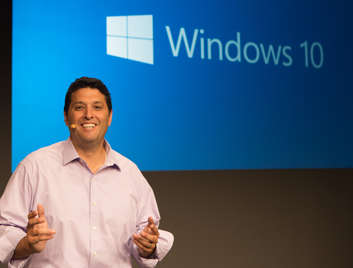
The next version of Windows has just been presented to the world and the biggest surprise is that it is to be called Windows 10 rather than the more logical Windows 9. The reason for the +2 increment in the version number is something we can all talk about for months. The reasons supplied by Microsoft are sort of plausible. The first is that the change from Windows 8 to this next version is so big that it merits a +2. Of course you could spin it the other way and point out that being +2 from the biggest flop Microsoft ever produced is a good marketing move. It's so far from Windows 8 that you don't need to worry or try to compare them. The second reason suggested is that Microsoft likes to call things "One" - XBox One, One Drive and so on - but they can't call it Windows 1 or Windows One because that's already happened. Of course they could have called it Windows One because that name hasn't been used, but instead it is Windows 10 that has been settled on. There is also the possibility that calling it Windows 10 has sunk all those pre-announcement "Window 9 Sucks" headlines. Windows 10 will be "our greatest enterprise platform ever", said Terry Myerson, Microsoft's head of operating systems - well he would say that wouldn't he. You can check out the company line in the following short video:
More important than the name is the news that Windows 10 is the OS for all device types - including Windows Phone. The intention is to build a platform that scales from small mobile devices all the way up to Azure. Exactly how this will work in terms of existing Windows Phone apps isn't clear. Instead of forcing a touch-based mobile start screen on desktop users, the OS will make use of a new feature called "Continuum", which lets the UI change according to the device it is running on. On a desktop machine with a mouse and keyboard the UI will be more like Windows 7; on a touch screen device it will be more like the Windows 8 start screen. The start button and its menu is back and has hierarchical folders and the start screen also has hierarchical folders on the left to provide better organization. As expected, the start button also has live tiles in a large area to the right - a sort of mini start screen. For touch users it seems the charms bar is being retained - but who knows in what form. The Windows 7 snap feature is now available to all types of app with the screen divided into four areas. It is true that "Metro" apps, which we are now probably going to have to call universal apps, do run in windows on the desktop - which increases their utility to the user and their attractiveness to the programmer. The rumors of multiple desktops is also true and users can switch between virtual desktops. New UI components show tasks running on all desktops. A single app store will server the unified OS and you will buy apps that run on all devices. Enterprises will be able to create custom apps stores for their employees.
A technical preview should be available on October 1st and the OS should be launched some time in late 2015. Microsoft needs to move fast because Window 8 is now dead in the water. UPDATEMicrosoft posted a 30 minute video showing Windows 10 features:
And a short video (no sound) showing continuum:
More InformationMicrosoft unveils the future of Windows
Related ArticlesWindows XP Loses Share Windows 8.1 Gains Developers - Microsoft Is Back! Windows 8 Doing Badly, Windows 7 Gets Extension Microsoft Reveals "Universal" Apps Windows 8 Users Hardly Use Any Modern Apps How Microsoft Could Have Done Metro
To be informed about new articles on I Programmer, install the I Programmer Toolbar, subscribe to the RSS feed, follow us on, Twitter, Facebook, Google+ or Linkedin, or sign up for our weekly newsletter.
Comments
or email your comment to: comments@i-programmer.info
|
|||
| Last Updated ( Wednesday, 01 October 2014 ) |


